Coordinate
10U DV 90114 02569
MGRS · WGS 84
Character · Text · Icons & symbols · Colour · Surfaces · Shape & space · Components · Placement · Motion & words · Accessibility · Enforcement · Screens
The rules every screen follows. Views use tokens, never raw values: no .font(.caption),
no Color(white: 0.2), no cornerRadius: 12, no .padding(14).
Tokens live in
Design/Mockup/Mockup/DesignSystem.swift, shared parts in Components.swift, and
Design/Mockup/.swiftlint.yml fails the build on anything else. Every image on this page is a
crop of the working mockup, shown at its real point size.
A working tool for people who navigate for a living: search and rescue, surveyors, soldiers. Dark only. Dense, legible, calm. Solid boxes you can hit with a cold thumb. The map is the star; the chrome stays out of its way. It should feel closer to an instrument than to a lifestyle app.
Fifteen roles, applied with .textRole(_:). Each is a Dynamic Type style, so all text scales
with the user's text size. Samples are shown at the default size.
| Role | Sample | Style | For |
|---|---|---|---|
title | My Location | Title 2, bold | Every panel's title, always with a subtitle |
readout | 10U DV 89755 | Large Title, mono, semibold | Your coordinate |
heading | 270° W | Title, semibold, mono digits | Compass heading and the turn |
value | 879 m | Title 2, medium, mono digits | A data cell's value |
valueCode | 10U DV 90114 02569 | Title 2, mono, medium | A coordinate in a data cell |
headline | Junction | Headline | A name in a card or banner |
body | Sea to Summit Trail | Body | List rows, descriptions |
detail | 469 m @ 130° SE | Subheadline, mono digits | Distance and bearing under a name |
caption | 9 items · May 18, 2023 | Caption | Counts, dates, footers, notes |
label | Coordinate | Caption, bold, uppercase, 0.6 tracking | Metadata only: cell titles, tags, kickers |
button | Go Here | Footnote, semibold, Title Case | Box buttons, chips, bulk actions |
badge | Location Services Off | Footnote, semibold | Map badges, Stop |
badgeCode | 10U DV 89610 02760 · 655 m | Footnote, mono, semibold | A coordinate in a badge |
mapLabel | CKP 3 | Subheadline, bold, with a halo | A marker's name on the map |
tab | Compass | Caption 2, semibold | Tab row titles |
label;
buttons are Title Case button. Never call .uppercased().title with a subtitle that says
something useful. The compass heading and turn are the one exception, in heading.detail and caption,
and only on a solid surface. On glass, text is primary.Font.drawn(_:), the only fixed size allowed.
title with a detail subtitle that earns its place.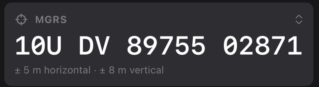
label title, readout coordinate, caption accuracy.SF Symbols only. A symbol inside text takes the text's role. On its own, a symbol uses one of two sizes.
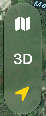
IconSize.control · 17 pt semiboldHeader circles and the map capsule (base map, 3D, follow).
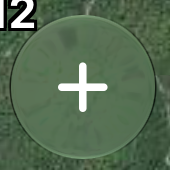
IconSize.large · 20 pt semiboldBox buttons, the tab row, the launcher, the banner arrow, the turn indicator.
Every symbol the app uses is named in Symbol. Two ideas never share a symbol, and one idea never has two.
| Idea | SF Symbol | Idea | SF Symbol |
|---|---|---|---|
| Location tab, a coordinate | scope | Navigate, Go Here | arrow.triangle.turn.up.right.diamond.fill |
| Compass tab | location.north.circle.fill | Stop | xmark.octagon.fill |
| Library tab, a layer | square.3.layers.3d | Follow, my location | location.fill |
| Settings tab | gearshape.fill | Map centre | plus.viewfinder |
| Elevation | mountain.2 | Distance, Measure | ruler |
| Bearing | location.north.line.fill | Course | location.north.line |
| Declination | angle | Speed | speedometer |
| Route | point.topleft.down.to.point.bottomright.curvepath | Area | skew |
| Track | point.bottomleft.forward.to.point.topright.scurvepath | Record | record.circle |
| Go to Coordinate | location.viewfinder | Marker at Coordinate | number |
| Download offline map | arrow.down.circle | Import | square.and.arrow.down |
| Location Services Off | location.slash.fill | Poor GPS | exclamationmark.triangle.fill |
| Buy | heart.fill | Turn left / right / on bearing | arrow.turn.up.left · .right · arrow.up |
Colour has a job. Nothing is coloured for decoration. Every colour goes through Palette, so a red
night-vision mode is a second palette, not a second app.
Eight colours (red, orange, yellow, green, cyan, blue, purple, white) and eleven hard-edged shapes, drawn with LandNav 1's own code. Every colour, shape, map label and short code is in Markers.html.


The colours users give markers, tracks and areas never appear in the chrome, except as that item's own icon.
Glass for quiet things floating over the map, solid for anything dense, and loud solid badges for anything the user should want gone.
.floatingGlass()Quiet things floating over the map: the tab row, map controls, status badges, the navigation banner, header circles, and the phone sheet at its smallest height.
Solid red for Location Services Off and poor GPS, yellow for Buy Land Nav. Dark or white ink and a small shadow. Status badges (recording, map centre) stay glass.
.solidSurface(radius:)Anything dense: the sheet at half and full height, the iPad column, menus, the selection bar, box buttons. Glass over a satellite map is hard to read outdoors.
Tags, chips
Cells, box buttons, menus, bars
The iPad column
| Token | Points | For |
|---|---|---|
touch | 44 | Nothing tappable is smaller |
boxButton | 64 | Height of a box button |
chip · badge | 32 | Chips and map badges |
reachButton | 48 | Follow and plus |
panelHeader | 52 | A panel's title row |
banner | 56 | The navigation banner |
Build screens from these. A new one gets added here before it is used twice.

PanelHeaderEvery panel's top row: optional leading icon, a title, a detail
subtitle, and up to two header circles. It is all that shows at the smallest height.

MarkerIcon in the item's own colour, title, detail, and a
PanelHeaderButton to close.

ActionRowUp to four box buttons: solid fill, one size, button text in Title Case,
IconSize.large. The first may be prominent (yellow). Destructive actions are red and never first.
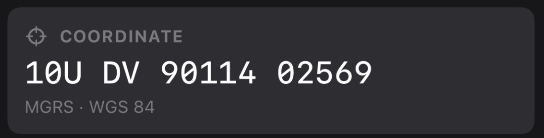
DataCell · CellCardlabel title with its symbol, a value or
valueCode, and an optional caption footer. The unit of information. On a raised fill.

BoxChipSmall boxes in a panel toolbar: Select, Sort, Make Active. button text, 32 tall,
small radius. A chip turns yellow while its mode is on.
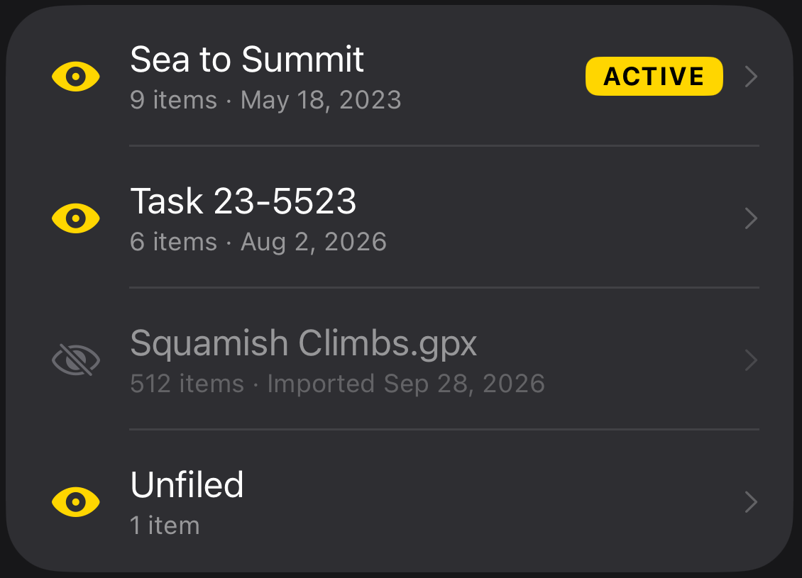
ActiveTagInset grouped lists on raised. Row title is body, subtitle
caption. The eye toggles a layer; a hidden layer's row drops to 50%. ActiveTag marks where new items go.

Bulk actions above the tab row while selecting. Solid, medium radius, count in
headline, actions as chips; Delete is red and last.
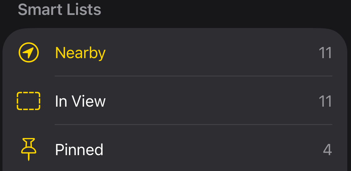
Lists that look across every layer: Nearby, In View, Pinned, Recently Added, Tracks, Routes and Areas, Recently Deleted. Later, users can make their own.

NavigationBannerThe navigation target, top of the badge stack. Yellow-tinted glass capsule, 56 tall. Arrow turns toward the target. Stop is always one tap.
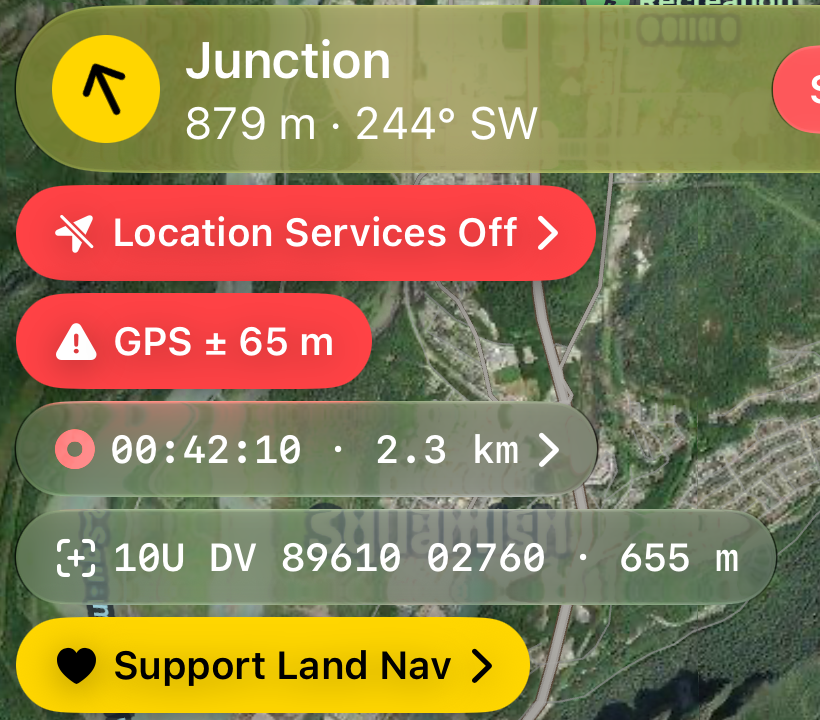
MapBadge and the badge stackTop leading. The banner first, then badges in one fixed order: Location Services Off, poor GPS, recording, downloading, map centre, Support Land Nav. Four styles: alert (red), warning (orange), nag (yellow) and status (glass). A chevron means tapping it does something.
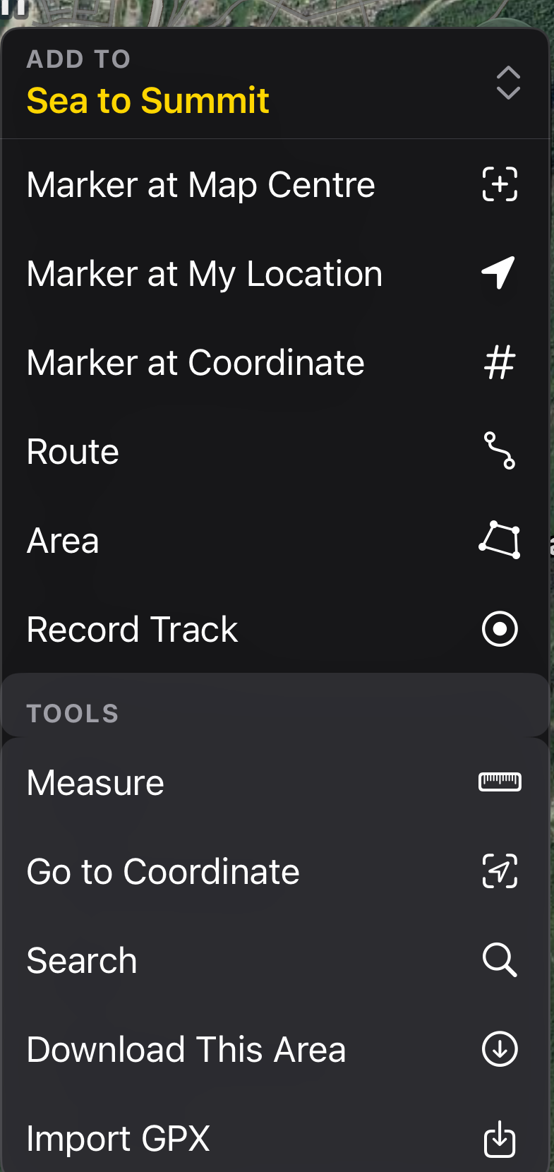
The plus button opens every feature that starts from the map. First, what gets added to the active layer, which the kicker names and can change. Then Tools, on a raised block: Measure, Go to Coordinate, Search, Download This Area, Import GPX. Rows 42 tall with the symbol trailing.
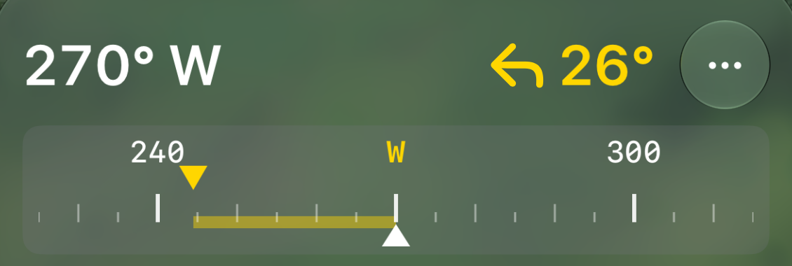
TurnIndicatorHeading as a readout. The turn is a symbol and degrees, never
words. Numbers on top in mono, ticks below, your heading as a white pointer at the bottom, the bearing as a yellow
pointer on top, and a yellow band for the turn still to make.
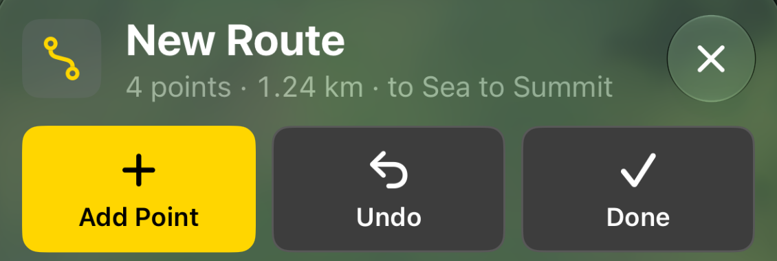
DrawingPanelDrawing a route or an area on the map as it is. It takes over the panel like a selected item, hides the tab row until Done or Cancel, and stays small so the map stays big. Tap the map or Add Point at the crosshair.
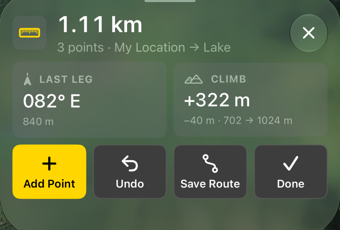
Measure and Download This Area work like DrawingPanel: a tool icon on raised,
the result as the title (1.11 km, mono when it is a number), at most two DataCells, then an ActionRow
with the primary action first and Done last. No tab row until Done or the close circle.
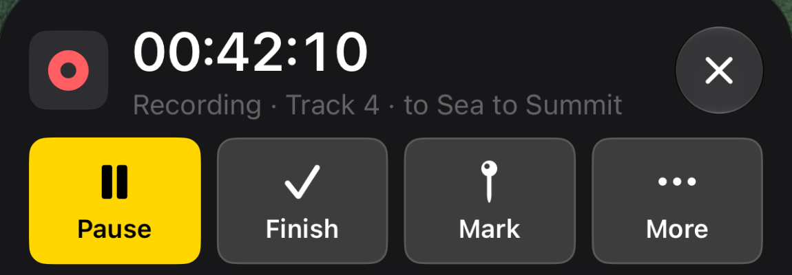
Something that keeps running, like recording, is not a mode. Its panel covers the tab like a
selected item, its badge reopens it, and closing it leaves it running. The live number is the title in heading.
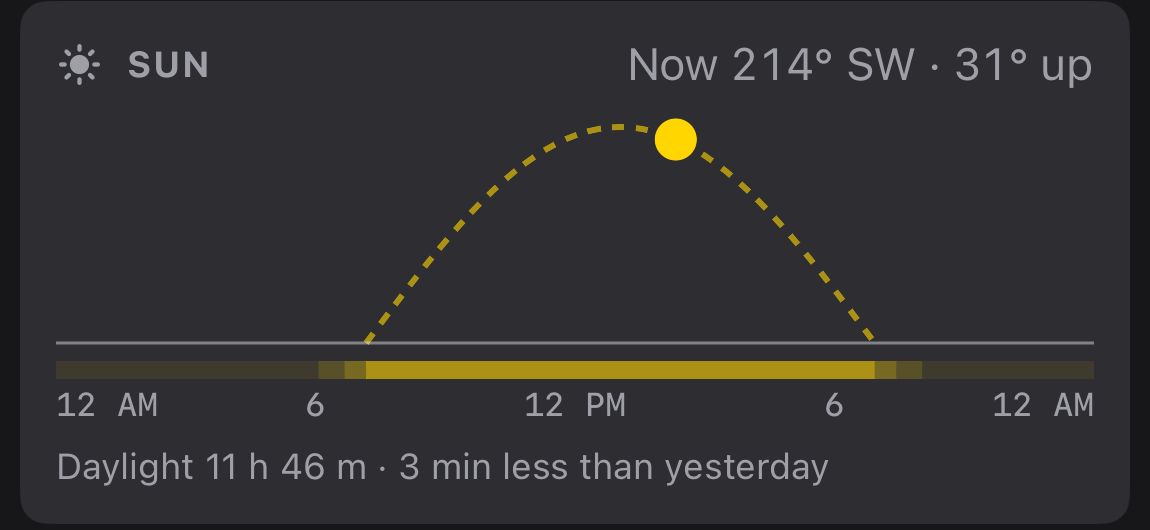
CellCardSun path, elevation profile. Drawn in a Canvas inside a card, one
colour from the palette, axis text in Font.drawn mono. No gridlines, no legend: the card title says what it is.

PanelTabRowFour tabs in a glass capsule inside the panel. IconSize.large over
tab text. The current tab is accent on a raised capsule.
The first box button, in yellow. One per screen.
Red, never first, never yellow. At the bottom of a list or menu.
Library, then layer, then item: all inside the panel.
Anything with a keyboard is a system sheet with Cancel and Done.
Box buttons for the three or four things done most. Menus for four or more choices.
Base map, 3D and follow in one capsule, top trailing. The launcher alone, bottom trailing, riding the top of the sheet; its menu grows up out of it.
One animation, Animation.standard: snappy, no bounce, for every state change.
Nothing moves on its own except live data. Respect Reduce Motion.
Title Case for buttons, titles and menu items; sentence case for footers and notes. A button is one or two words. Say what happens: "Go Here", not "Update navigation destination". Same thing, same word, everywhere: marker, track, route, area, layer, target.
.swiftlint.yml has six custom rules, all errors, all skipping DesignSystem.swift.
Text("GO HERE")
    .font(.caption2.weight(.bold))
    .padding(14)
    .background(Color(white: 0.24),
      in: .rect(cornerRadius: 12))
withAnimation(.spring) { … }Text("Go Here")
.textRole(.button)
.padding(Space.m)
.background(Palette.control,
in: .rect(cornerRadius: Radius.medium))
withAnimation(.standard) { … }| Rule | Catches | Use instead |
|---|---|---|
design_font | .font(.caption), .font(.system(size:)) | .textRole, IconSize, Font.drawn |
design_colour | Color(white:), Color(red:), .accentColor | Palette |
design_radius | cornerRadius: 12 | Radius |
design_spacing | spacing: 10, .padding(14) | Space |
design_uppercase | .uppercased(), .tracking(), .textCase() | .textRole(.label) |
design_animation | .spring, .easeInOut, .snappy | Animation.standard |
Every screen of the mockup, and the layout rules behind them, are in LandNav2.html.
Land Nav 2 • Send Feedback • Land Nav 1 • © 2026 Gerry Shaw